Our Theme - Oct/Nov 2020
Our Theme - Oct/Nov 2020
Our Theme - Oct/Nov 2020
May tranquility return
HF #198 | Christine StomanSo, the theme of this edition of HouseFinder is Dulux’s Colour of the Year: Tranquil Dawn. Over the years, both Pantone and Dulux have selected and celebrated certain colours. It has become quite a thing. In 2000, the Pantone Color Institute came up with the idea “as a trendsetting concept for branding, marketing and creative society as a whole”.
By 2007 colour trend forecasting had really taken off. Essentially any entity may choose a colour of the season or year. Natasha Levy of Dezeen magazine, a highly influential architecture and design publication based in the UK, summarised Dulux’s announcement, saying that Tranquil Dawn hopes to be “an antidote to an increasingly disconnected modern society, and embodies the nation’s mood on the approach of a new decade. It reflects a growing desire to understand what it is to be human at a time when advances in technology (robotics, big data and artificial intelligence) are making us feel increasingly disconnected from each other.”
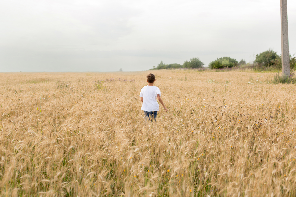
According to Dulux, the colour “embodies the nation’s mood”. Their panel of experts identified that the world has a growing desire to understand what makes us human. “Against a background of increasing technological power, we want to understand our place in society and how we can make a positive impact on it.” Dulux’s UK creative director, Marianne Shillingford, compares the colour to “the space between the land and sky”. Fact is, the panel’s decision was taken in 2019. And this year has been anything but tranquil. It reminds me of Proverbs 16:1-9, where the bottom line is “mortals make elaborate plans, but God has the last word.” (The Message).
The panel actually chose the colour known as Grey Jeans (45GY 55/052) and renamed it Tranquil Dawn. Now isn’t that ironic? Had they left it at Grey Jeans, then at least it would have fitted this stay-at-home-and-lounge-about-inyour-jeans year. That hue, that specific pale green-grey, which was meant to kick-start a year of tranquillity in a new decade, could very well now be named The Winter of our Discontent (with thanks to Shakespeare and Steinbeck). It is rather greyish, like a murky winter’s day, with a splash of subdued green to buoy up our spirits.
It does help to realise that the title of John Steinbeck’s novel, The Winter of our Discontent, was borrowed from William Shakespeare. It comes from the very first lines of his play Richard III. The lines that follow thereafter, thank goodness, actually describe the brooding clouds departing and the feeling of discontent being replaced by “a glorious summer”. Hence, in Shakespeare’s play, better days were on their way for England’s royalty. May ours be a glorious summer too, with a touch of tranquillity.

May tranquillity return Dulux colour of the year, Tranquil Dawn, reflects the space between the land and sky.


